This past Sunday was the Twin Lakes Triathlon in Palatine, Illinois. This was my first attempt at a triathlon, and I went a bit overboard in analyzing the race data.
I wrote a small program which uses the race results to create detailed graphs and generate a personalized PDF report (see this example). For anyone else who participated in this year’s race, I’d be happy to generate a similar PDF format report with your results. Just email me at camontgom[at]gmail.com.
I've posted a few basic graphs showing some time distributions below.
Time Distributions by Discipline
The histograms in this section show the distribution of times for the swim, bike, and run segments. The average time, the median time, and the standard deviation for each segment is also noted on the plot.
Age Group Data
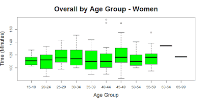
The graphs below break the discipline splits down by gender and age group. The "box plot" for each age group shows the median time as the center line, and the colored center box shows the 25th to 75th percentile range. The top and bottom bar of the "whisker" shows the max and min times in the age group. However, if there data points that are well outside the "typical" range, then these are shown as a individual dot rather than the bar of the whisker. A more detailed explanation of the box plot can be found on Wikipedia.


No comments:
Post a Comment